![]()
Portfolio
Surface patterns
Visual identity
Contact me
Instagram
Whatsapp
Envelope
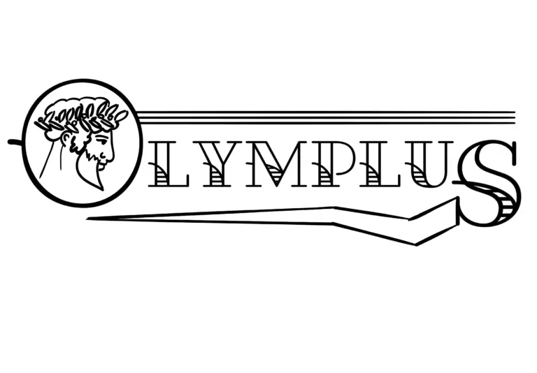
Olymplus
Logo design | Branding colours and assets
Olymplus was a health food startup that aimed to help people improve their dietary habits without sacrificing the rich, indulgent flavours that often lead us toward unhealthy choices.
They wanted a brand identity that exuded health, a modern feel and the physical and emotional strength of characters within Greek mythology. This resulted in a bold, empowering logo inspired by ancient mythology, seamlessly blending these tales with a contemporary aesthetic.
Erin completely understood what we needed for Olymplus and nailed the look and feel of the brand.
The client form made everything really clear and helped us to align super quickly. Communication was so easy throughout the whole process.
She’s fast, professional and everything she delivered was beautifully made. Thank you Erin for bringing our ideas to life!
CONCEPT EXPLORATION
To develop a design that aligned with their vision, I explored Greek mythology, architecture, and art as key visual influences. My research led me to three distinct directions:
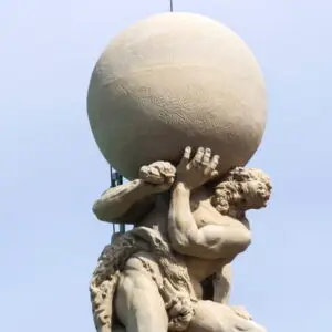
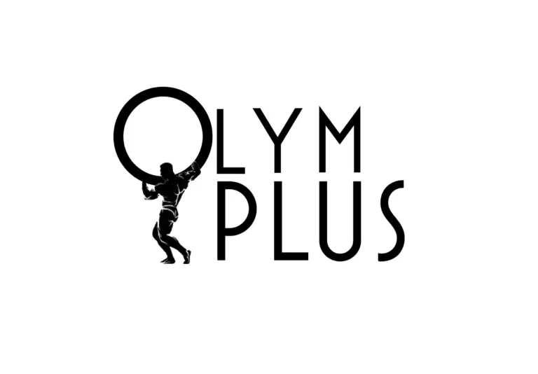
Mythological Strength: Inspired by figures like Sisyphus, eternally pushing his boulder uphill, and Atlas, holding the world on his shoulders, symbolizing perseverance and power.
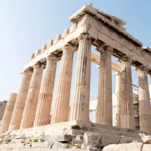
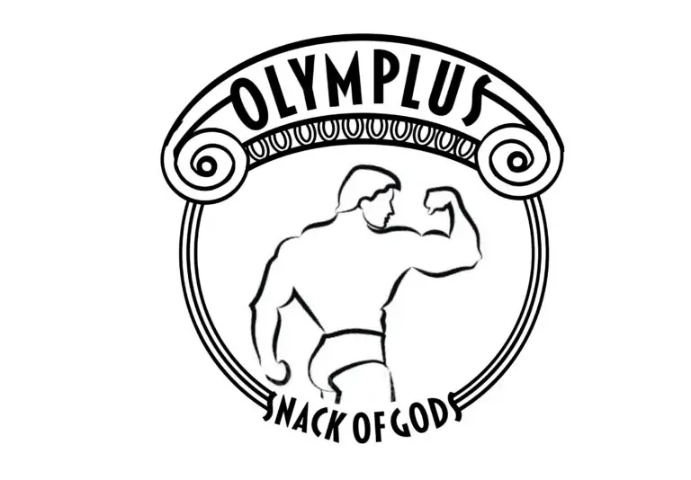
Architectural Influence: Drawing from the timeless elegance of Ionic-style columns, evoking balance and structure.
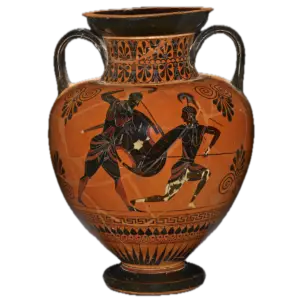
Ancient Artistry: Examining traditional Greek amphora paintings, with their strong silhouettes, bold red and black hues, and dynamic character depictions.
DESIGN
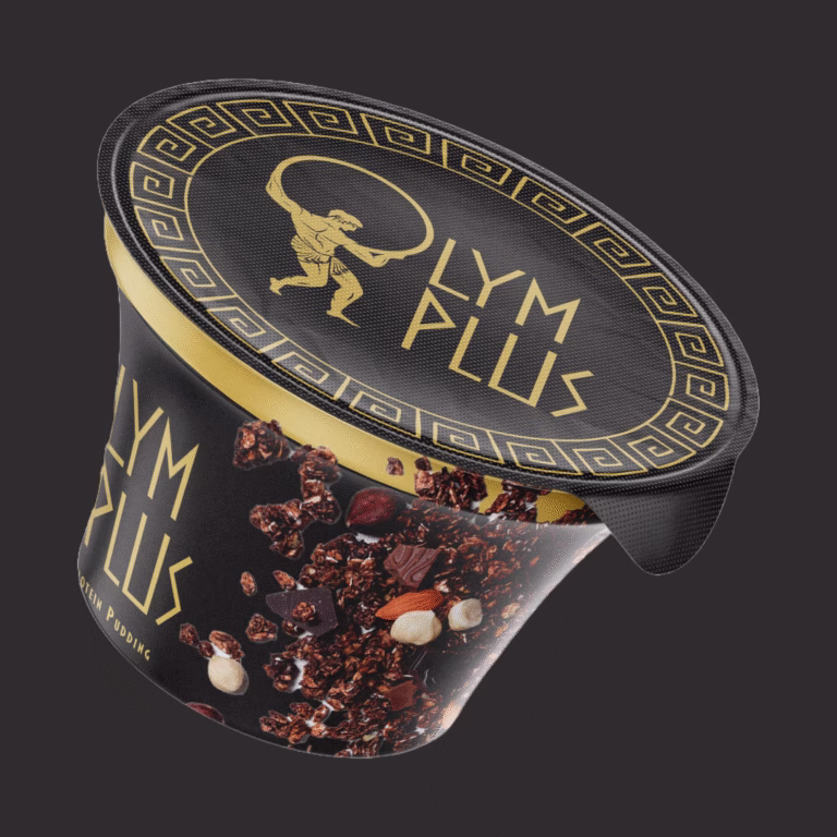
After presenting three distinct directions, the client selected a concept that seamlessly merged mythology with modernity: a powerful figure carrying a boulder, forming the ‘O’ in Olymplus.
DELIVERABLES
The selected concept was refined into a versatile brand identity system, ensuring adaptability across different media and applications and included the following deliverables:
-
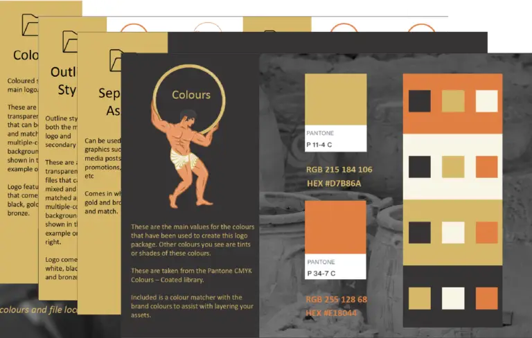
A full-color primary logo, incorporating bold colours -
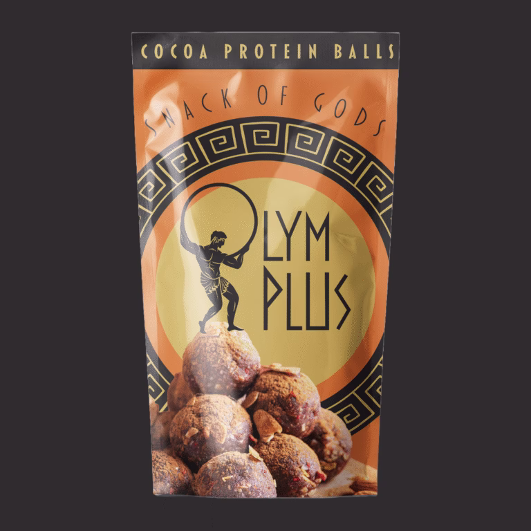
A solid monochrome version for flexibility across brand assets -
An outline logo, providing a minimalist alternative -
Custom logo assets, breaking down key elements for use in brand collateral -
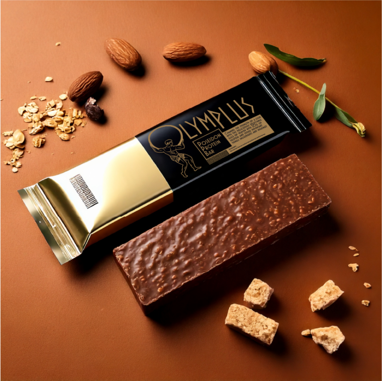
Branding colours of earthy tones inspired by Greek amphorae (deep reds, blacks, and warm neutrals) -
Comprehensive logo catalogue, showcasing all variations of the design on different background colors from the brand palette
While Olymplus was ultimately unable to move forward with this branding due to unforeseen circumstances, this project remains a strong example of my ability to translate a brand’s mission into a distinctive, meaningful visual identity.
To develop a design that aligned with their vision, I explored Greek mythology, architecture, and art as key visual influences. My research led me to three distinct directions:
Mythological Strength: Inspired by figures like Sisyphus, eternally pushing his boulder uphill, and Atlas, holding the world on his shoulders, symbolizing perseverance and power.
Architectural Influence: Drawing from the timeless elegance of Ionic-style columns, evoking balance and structure.
Ancient Artistry: Examining traditional Greek amphora paintings, with their strong silhouettes, bold red and black hues, and dynamic character depictions.
After presenting three distinct directions, the client selected a concept that seamlessly merged mythology with modernity: a powerful figure carrying a boulder, forming the ‘O’ in Olymplus.
The selected concept was refined into a versatile brand identity system, ensuring adaptability across different media and applications and included the following deliverables:
-
A full-color primary logo, incorporating bold colours -
A solid monochrome version for flexibility across brand assets -
An outline logo, providing a minimalist alternative -
Custom logo assets, breaking down key elements for use in brand collateral -
Branding colours of earthy tones inspired by Greek amphorae (deep reds, blacks, and warm neutrals) -
Comprehensive logo catalogue, showcasing all variations of the design on different background colors from the brand palette
While Olymplus was ultimately unable to move forward with this branding due to unforeseen circumstances, this project remains a strong example of my ability to translate a brand’s mission into a distinctive, meaningful visual identity.
![]()
Portfolio
Surface patterns
Visual identity
Contact me
Instagram
Whatsapp
Envelope